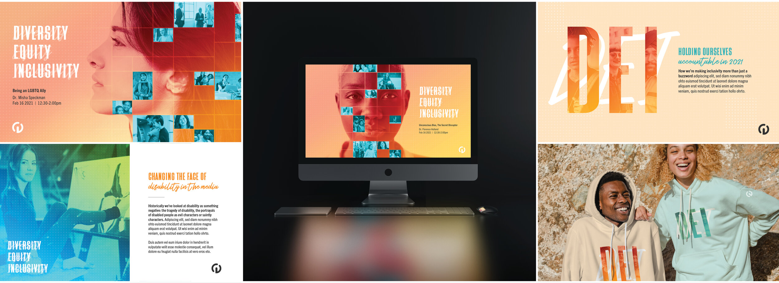

Centerline’s internal diversity, equity and inclusivity visual language. At the heart of this language is the representation of a broad range of people and the overlapping layers and colors of what makes these individuals a vibrant intersectional community working together.

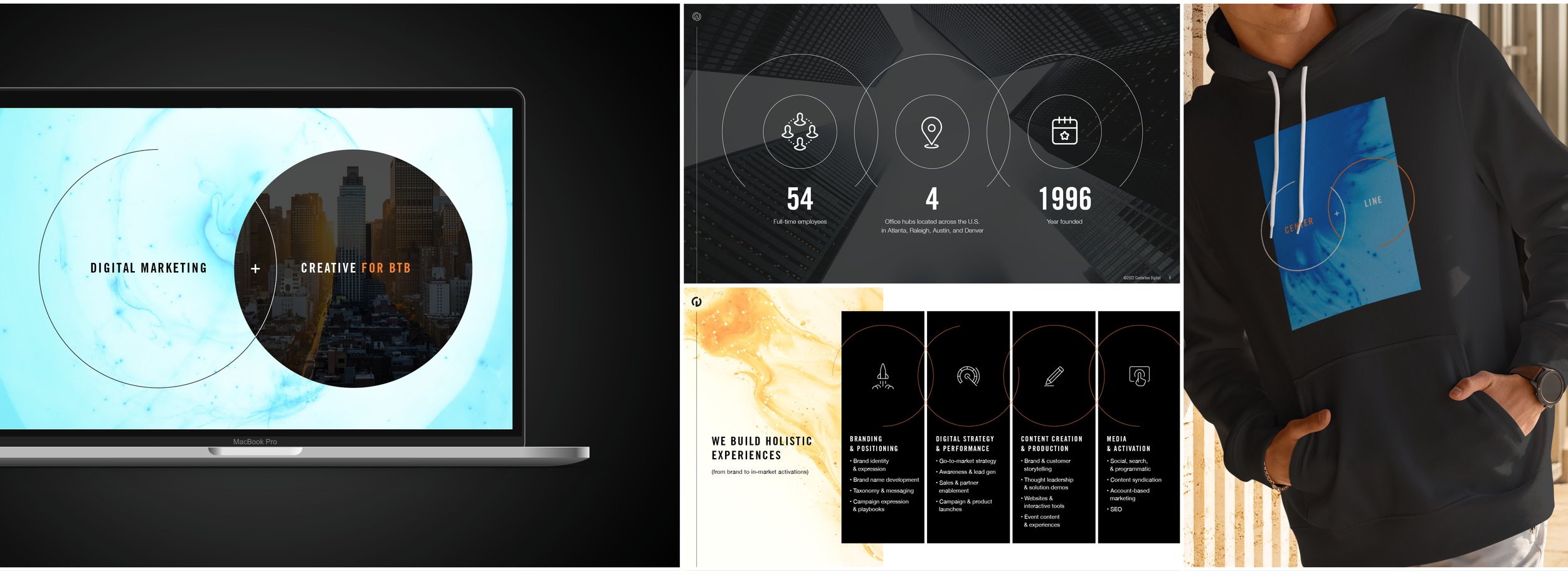
Our brand update centered around duality, which inspired me to curate an array of textures that were imbued with the brand colors. These textures were bold and contrasting between light and dark elements which reinforced the duality idea. The incorporation of circles flow together and symbolize balance, harmony and dynamic movement.

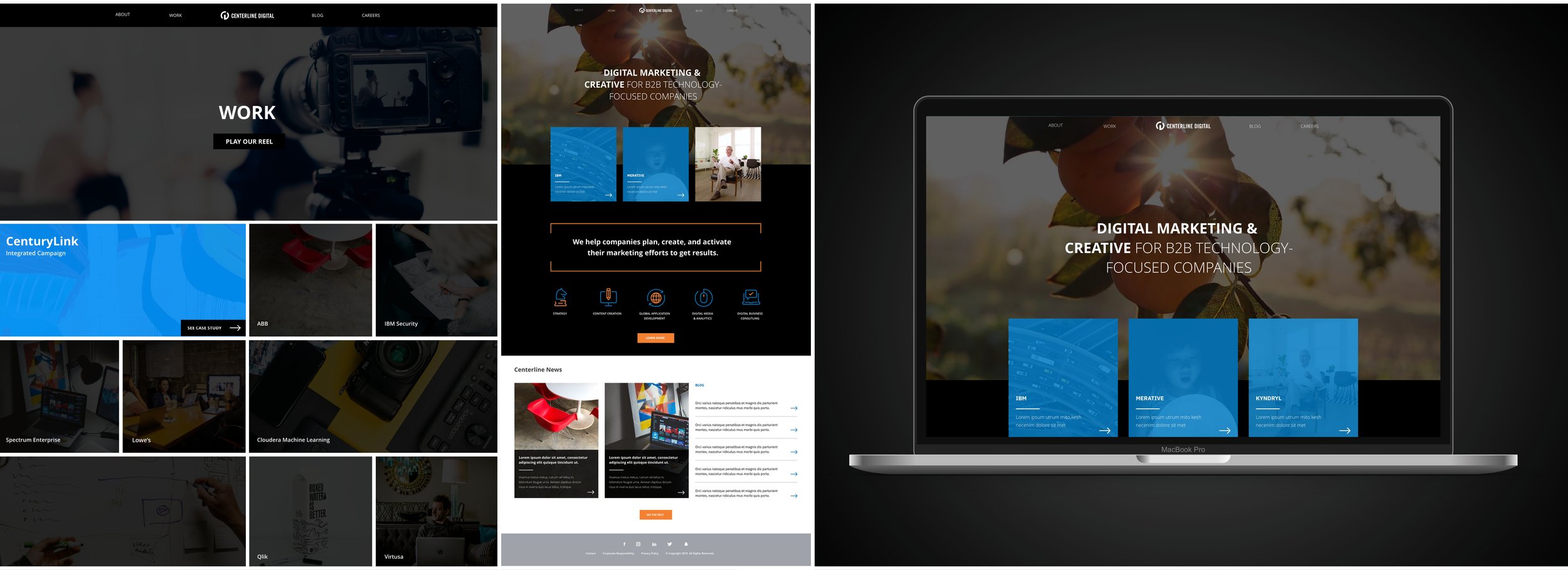
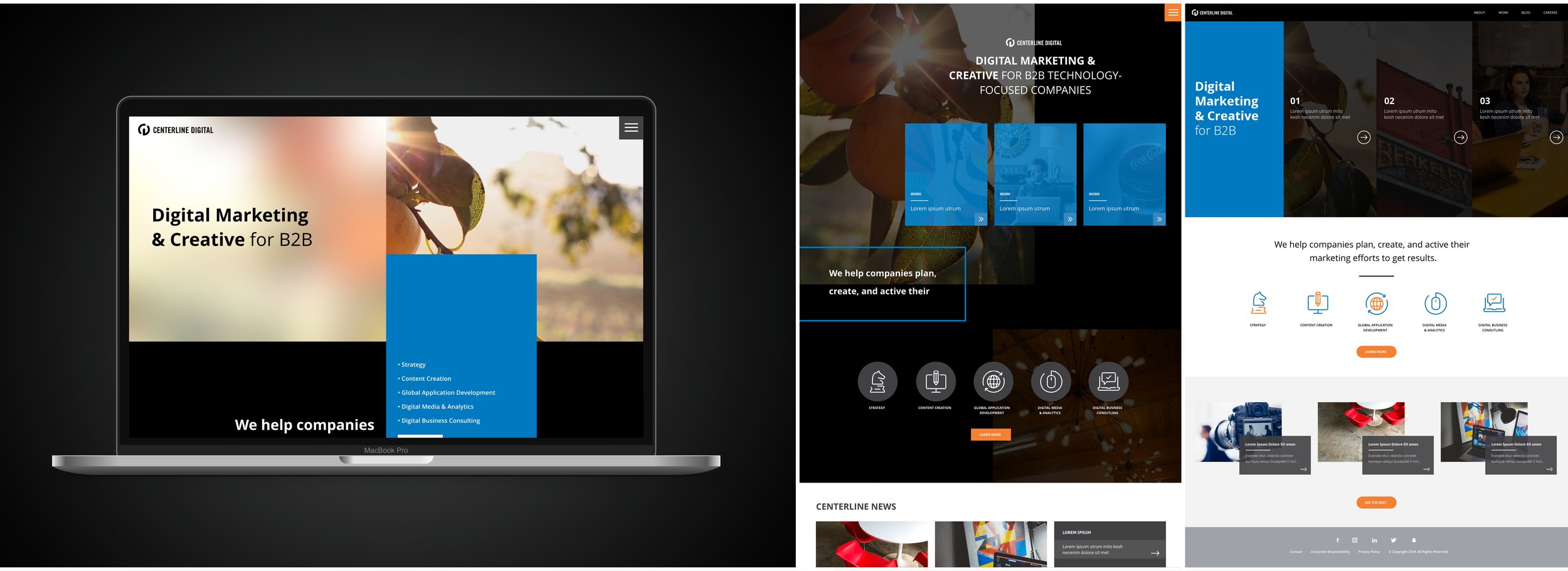
Updated website redesign for Centerline Digital. The objective was to incorporate a touch of boldness while still maintaining some alignment with our brand. The leadership sought to move away from our previous designs, which were closely intertwined with the internal brand. The result was a modern and assertive website with splashes of our brand identity.

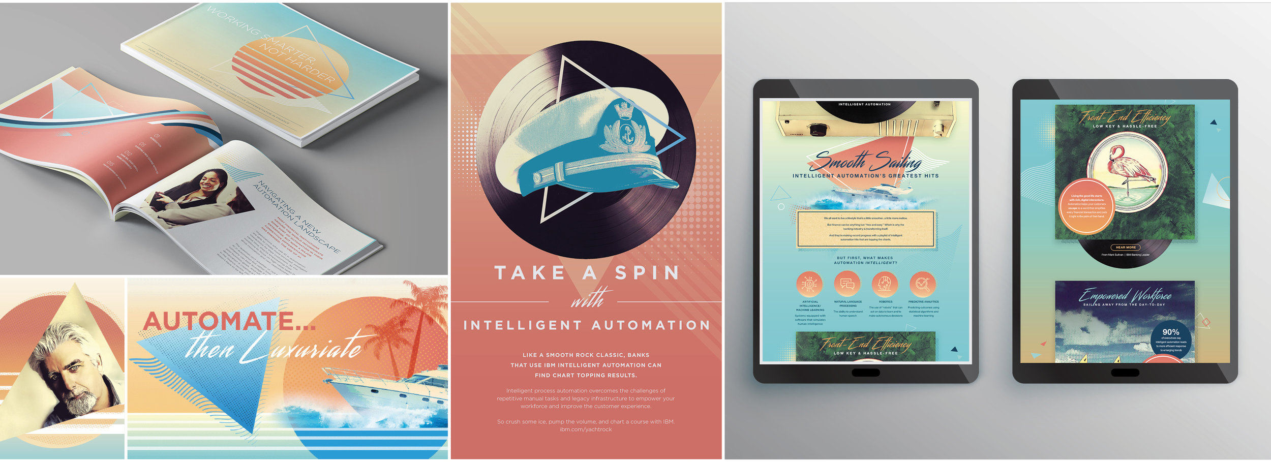
Various deliverables using unusual and eyecatching visuals based on mid to late 1970s era “Yacht Rock” geared towards COOs to illustrate a platform that promotes “smooth sailing” for bank automation.

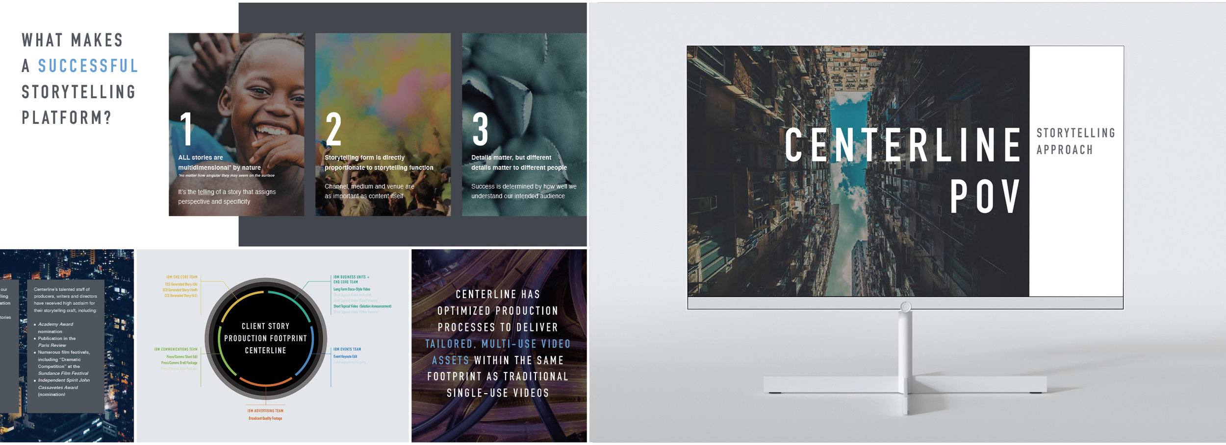
Presentation for potential clients that walks through Centerline’s approach to great content through storytelling.